Hamburger Menu

Making a Responsive Nav Bar
Legos
Leon Noel describes learning to code as putting Legos together. He said don't worry about developing a deep understanding when you are first learning. Rather, play around with code. Look up how to do something, copy and paste it into your code, change something about it, make it your own.
This is similar to how children play with Legos. They just grab some pieces and put stuff together until they like it or get bored.
Leon goes on to say that the deep understanding will come with time, but when you are first starting, your main goal should be to play with your code, break things, fix them, see how changes affect things.
Portfolio
As I was digging into making my first portfolio, I knew I wanted(needed) a few features; a responsive navbar with a cool hamburger menu, a dark mode(work in progress), and some hover effects on buttons and icons. I specifically wanted a cool hamburger menu that turned into an X when it was clicked. I knew I had seen those before and they always impressed me more than the simple hamburger buttons(no disrespect to people who have simple hamburger buttons).
Codepen
I watched a few videos about how to make a hamburger menu but didn't fully understand it(granted I watch them before I began learning JavaScript) so I decided to search for hamburger menu examples on CodePen. I came across this one and it seemed simple enough so I decided to copy and paste the code into my portfolio and play around with it until I liked it.
HTML
        <div id="icon">
            <span id=line-1 class=line></span>
            <span id=line-2 class=line></span>
            <span id=line-3 class=line></span>
        </div>
The HTML was pretty straightforward. There are three spans, which make the actual lines of the menu button, inside of a div. I placed this in my existing Navbar and went to the CSS to make some adjustments.
CSS
Here is the CSS from the CodePen:
#icon{
    display: flex;
    flex-direction: column;
    justify-content: space-between;
    height: 45px;
    width: 80px;
    cursor: pointer;
    z-index: 3;
    transform-origin: center;
}

//adding lines to the icon
.line{
    background: white;
    width: 100%;
    height: 8px;
    border-radius: 3px;
    box-shadow: 0 2px 10px 0 rgba(61, 61, 61, 0.8);
    position: relative;
    z-index: 2;
    transition: 0.3s ease;
}

//adding animation
.change #line-1{
    transform: translateY(20px) rotateZ(-45deg);
}

.change #line-3{
    transform: translateY(-15px) rotate(45deg);
}

.change #line-2{
    opacity: 0;
}
And here is my code after I made a few changes:
#icon{
    display: flex;
    flex-direction: column;
    justify-content: space-between;
    **height: 30px;
    **width: 45px;
    cursor: pointer;
    z-index: 3;
    transform-origin: center;
    **display: none;
}


.line{
    background: white;
    width: 100%;
    **height: 7px;
    border-radius: 3px;
    box-shadow: 0 2px 10px 0 rgba(61, 61, 61, 0.8);
    position: relative;
    z-index: 2;
    transition: .3s ease;
}

.change #line1{
    **transform: translateY(12px) rotateZ(-43deg);
    **box-shadow: none;
    **background: var(--secondary-color);
}

.change #line3{
    **transform: translateY(-11px) rotate(39deg);
    **box-shadow: none;
    **background: var(--secondary-color);
}

.change #line2{
    opacity: 0;
}
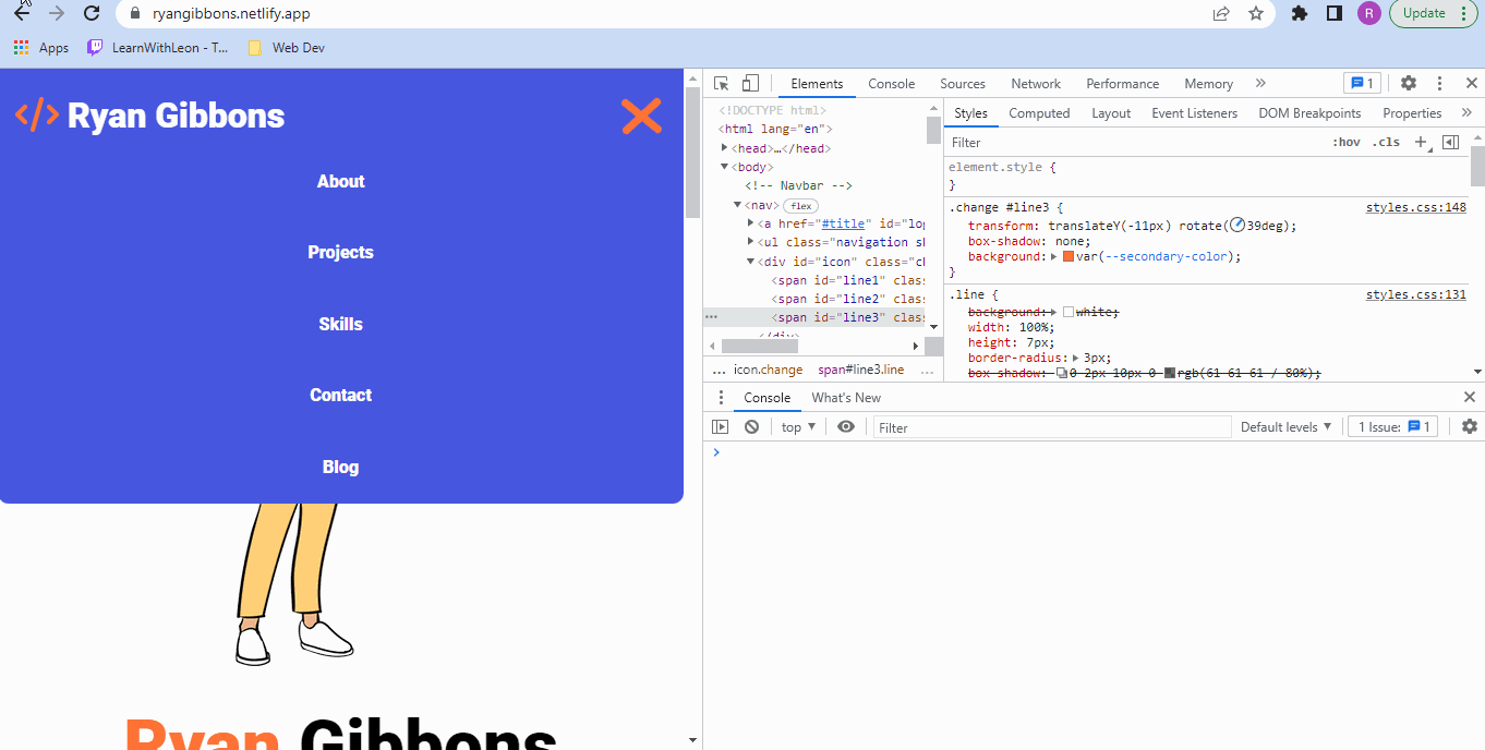
All of the changes I made have "**" at the start of the line. The main change was the overall size to fit my navbar. I put display none to make it not show on desktop size and later, in a media query that starts at mobile screen size, have display: flex to make it come back. I also changed the color of the lines when it's active because I thought it looked cool, and I removed the background shadow on the lines when the menu is active because I thought that didn't look cool.
Changing the sizes of the menu box and lines changed the look of it when it was rotated, which was a curveball I was not expecting. I used the dev tools in chrome to play around with the angle of rotations and amount of translation on each line until I was happy with it.
JavaScript
Here is the JavaScript from the CodePen:
document.querySelector('#icon').addEventListener('click', onClickMenu)

function onClickMenu(){
        document.getElementById("icon").classList.toggle("change");
}
The only thing this does is change the hamburger menu to an X when it is clicked and back to a hamburger icon when it is clicked again.
Here is what my JavaScript looks like:
// making things into variables
const burger = document.querySelector("#icon");
const ul = document.querySelector("nav ul");
const logo = document.querySelector('#logo')


// Select nav links
const navLink = document.querySelectorAll(".nav-link");
//removes nav list from screen when my logo is clicked
logo.addEventListener("click", () => {
    ul.classList.remove("show");
    document.getElementById("icon").classList.remove("change");
  });

// Hamburger menu function
burger.addEventListener("click", () => {
  ul.classList.toggle("show");
});

// Close hamburger menu when a link is clicked
navLink.forEach((link) =>
  link.addEventListener("click", () => {
    ul.classList.remove("show");
    document.getElementById("icon").classList.toggle("change");
  })
);


burger.addEventListener('click', onClickMenu)

function onClickMenu(){
        document.getElementById("icon").classList.toggle("change");
}
I added the functionality of showing my nav links when the hamburger menu is clicked, as well as hiding those links when one is selected, my logo is clicked, or the hamburger is clicked again.
Thanks For Reading
I hope this helps others to make their own cool hamburger menu, if you have any questions please reach out to me on Twitter and I'd be happy to help. You can see my finished product in action by looking at my website on mobile screen size.
Also, here is everything that made it work in a CodePen. Just a heads up, there is probably a lot of redundant code in there because I just copied a lot of stuff from my code.